This project was done during the COVID-19 era for Tabung Haji, an Islamic financial institution that provided services to the Muslim in Malaysia to save for hajj expenses.
Designing for the Maal Hijrah campaign materials, I created a cohesive collection that tells a story of adaptation and progress of my country, Malaysia, during the worldwide pandemic.

The first campaign shows our everyday heroes in their pandemic armor - medical staff in their PPE, frontliners with masks, all standing proud against the backdrop of the Twin Towers.
It's like Malaysia's version of a superhero team poster, but instead of capes, they're wearing masks and face shields! A symbolic work right there - standing tall together, even when we had to stay apart.
The soft purple tones are carefully composed to make something clinical feel wonderfully human. The design is a blend of traditional and contemporary elements:
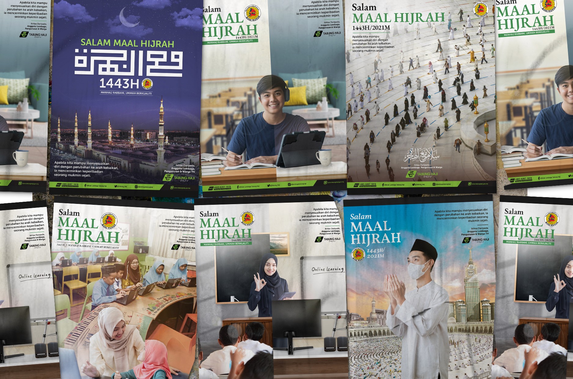
The navy blue poster with Arabic calligraphy and the illuminated Masjid Nabawi — it sets the perfect tone for 1443H
The cityscape backgrounds with mosques and modern buildings to create a perfect visual metaphor for tradition meeting progress
Authentic moments of online learning and digital adaptation
The consistent "Salam Maal Hijrah" branding ties everything together while speaking to different audiences
Masks, Laptops, Prayers

The Maal Hijrah series were done by trying to authentically capture how Malaysian Muslims navigated religious life during COVID-19 crisis:
Students mastering the art of online religious classes. Look closely and you'll spot those now-familiar homework-meets-home-life setups :)
The shot of someone studying from home, with random unplanned setup we all came to know. That's basically all of us discovering our "home office" or "learning space" could be anywhere with decent WiFi. Coffee cups, slightly messy desks, comfy clothes.
The social distancing markers and masks. It's a powerful reminder (even for me as a designer during those times) of how communities found ways to maintain spiritual connections while keeping everyone safe.
Those aerial shots of properly spaced worshippers? They're not just photographs - they're documentation of how faith adapted to unprecedented times.
A Story of Loss and Hope

The whole campaign feels hopeful rather than heavy.
I used lots of uplifting blues and greens (that signature Tabung Haji green coming through!), and every image tells a story of resilience. Each piece says "Hey, we're figuring this out together!". With the power of design, I utilized a color palette that felt calm and reassuring.
Because in a time when everything felt uncertain, I wanted these visuals to provide a sense of stability and hope.

Necessity is the Mother of Invention
For the brand consistency — I wanted the Tabung Haji green logo to pop up throughout the series like a familiar friend, yet never shouting for attention.
It's quite a journey. No sugar-coating, not gonna lie. Those visuals that I designed — carry a weight that touches all of us who lived through those difficult times.
But.. you know what hits particularly deep? Looking at these designs now, especially that frontliner image - each masked face represents countless untold stories of families who lost loved ones, of healthcare workers who couldn't save everyone despite their best efforts.
That Maal Hijrah theme of transformation takes on an even more poignant meaning when we think about how many families had to transform their way of grieving and finding strength.
It reminds me that even in the wildest of times, we've got this. Distance taught us love's true meaning, the hardest way. 😷