Ever wondered what happens when you mix the cozy warmth of chai with the satisfying sizzle of a perfect burger? That's exactly the sweet spot I aimed for with Moo n Chai's brand identity. The challenge? Creating a visual language that makes these two culinary worlds feel like they were always meant to be together.


Talk about a bold choice - that rich, energetic coral-red paired with deep browns just screams "flavor"! The color palette takes inspiration from both the caramelized char of a perfectly grilled burger and the warm, spicy notes of masala chai. It's a combination that grabs attention while still feeling sophisticated and appetizing.
Social Media & Marketing


Those Instagram stories and posts? They're designed to make thumbs stop scrolling! The "SIP. BITE. REPEAT." campaign shows how I turned simple food photography into scroll-stopping moments. Each frame is composed to highlight either the steam rising from a fresh chai or the juicy perfection of those burgers - sometimes both!
The typography plays between bold statements and playful descriptions, kind of like that friend who always knows the best spots to eat.
Brand Applications

From menus to marketing materials, everything follows this delicious design system:
Custom typography that's as bold as the flavors
A grid system that lets the food photography shine
Social media templates that make every post mouth-watering
Menu designs that turn ordering into an experience
Packaging that's as Instagram-worthy as the food inside

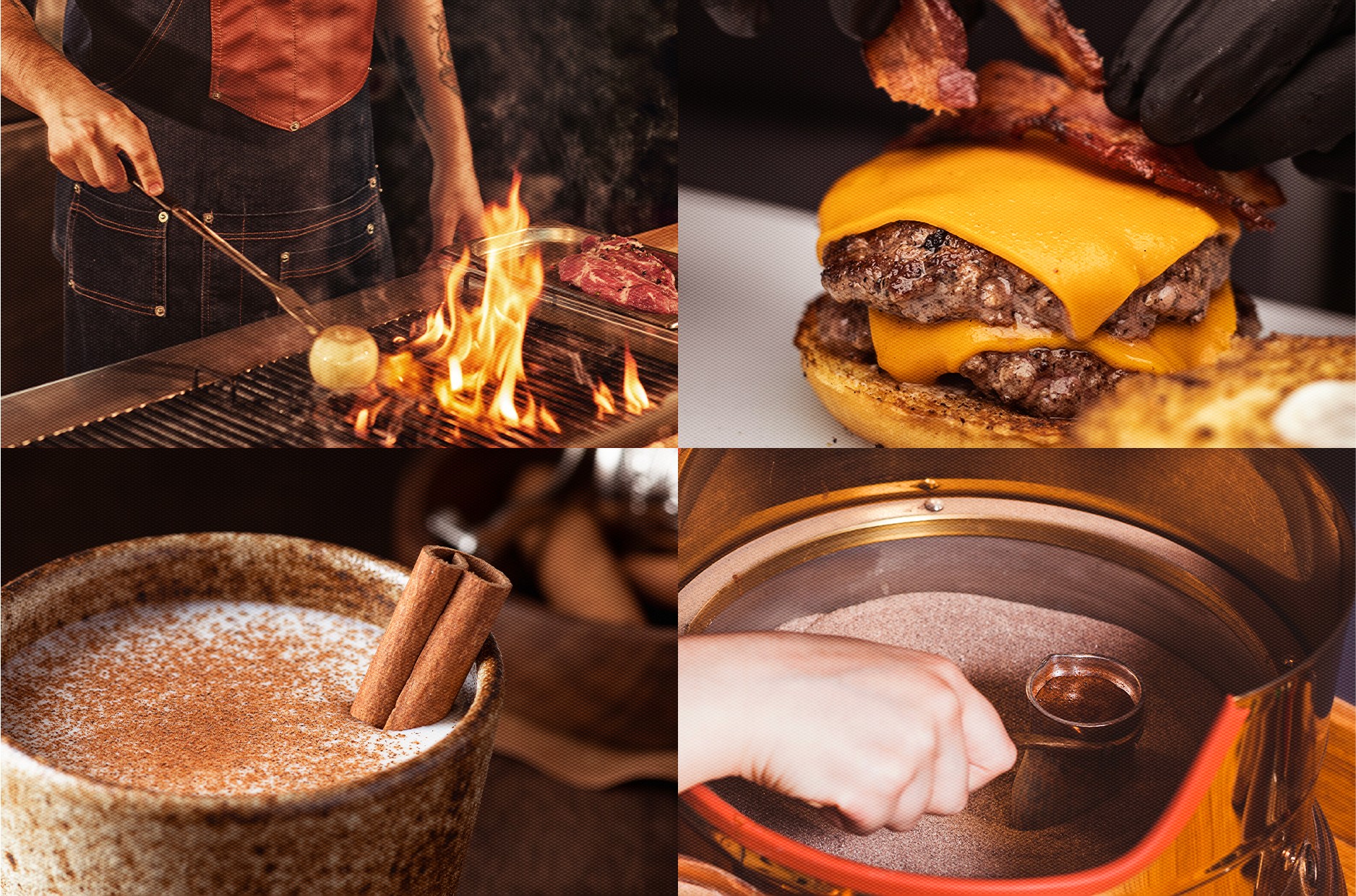
Photography Direction
The photo style is where things get really juicy (pun intended!). I've got these gorgeous action shots of flames licking the grill, chai being poured with that perfect swirl, and burgers that look so good you can practically smell them through the screen.
It's real, it's raw, and it makes you hungry just looking at it.