Let me walk you through this fun yet super functional project I created for UCA's Open Days - where wayfinding meets whimsy!
Who says signage has to be boring? I designed these with interaction in mind—visitors can spin one to create fun word combinations, pop their face into a cutout for a quick photo op, or scan a QR code for extra info and directions. Another signage provides clear wayfinding with a physical campus map and a QR code for digital guidance. It’s all about turning functional signage into an experience—inviting people to engage, explore, and actually enjoy finding their way around.


You know that slightly overwhelming feeling when you're in a new place and have no idea where you're going? That's exactly what I set out to solve.
Through user research and journey mapping (yep, those sketches you see in the research poster!), I identified the main pain points new visitors face and turned them into opportunities for delightful interactions. This simplicity ensures that the signage doesn't compete with the surrounding architecture but rather complements it.
Let me introduce you to Arty as well, our triangular mascot who's basically the friendliest geometry you'll ever meet! My groupmate, Anastasia designed this little character to be the face of UCA's navigation system, popping up everywhere from signs to digital maps with different expressions and poses suited for each department that the university consist of. Think of them as your quirky creative compass around campus!
The Solution: A Multi-Touch Navigation System


I chose the typography that is clean, modern, and highly legible. It's like the clear, confident voice of a friendly guide, leading you along the way. The font choices are likely sans-serif for optimal readability, even from a distance.
The size and placement of the text are carefully considered to ensure that information is conveyed effectively without overwhelming the viewer.
Here's what I cooked up:
A clean, energetic color palette of lime green and hot pink that's impossible to miss (but in a good way!)
Super clear wayfinding elements that guide visitors from car park to quad without breaking a sweat
Turned the campus into a friendly scavenger hunt, minus the frustration of actually hunting for things
Major destinations are prominently displayed, while secondary information is presented in a more subtle way. It's like a well-structured map, with main roads clearly marked and smaller streets branching off. This ensures that users can quickly grasp the overall layout and then focus on the specific details they need.
Implementation & Testing

The final system includes:
Physical signage and environmental graphics
A detailed campus map that doesn't look like a maze
Time-organized event flyers (because nobody likes missing the good stuff)
Character-driven wayfinding that makes navigation feel less like a chore and more like a conversation with a friendly guide
Imagine we're taking a stroll through a modern campus, and I'm pointing out all the design elements that guide us along the way. This project is all about creating clear, intuitive, and visually appealing signage for a contemporary architectural space.
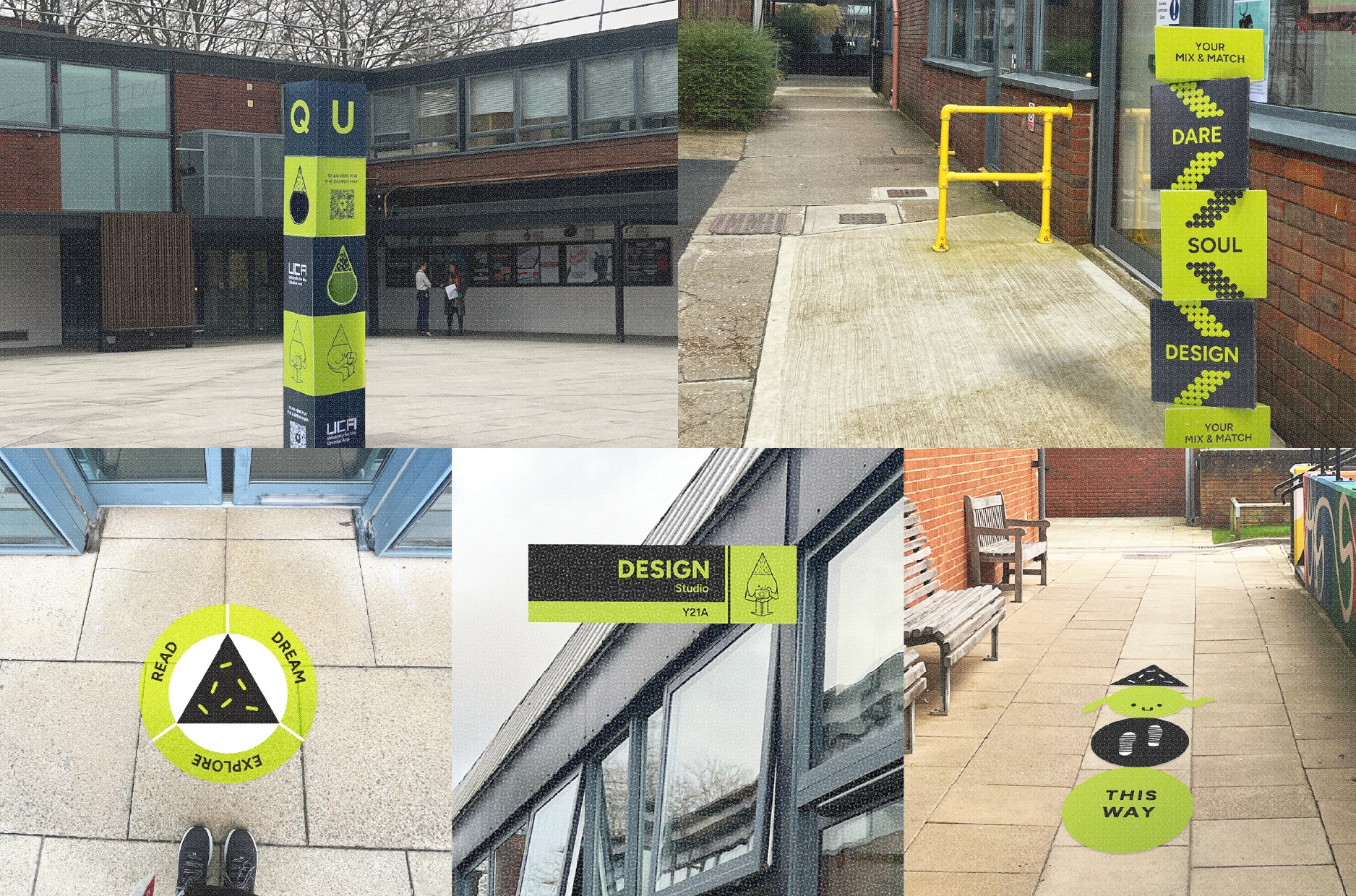
Integrated with Architecture
Getting lost on Open Day? Not on my watch. I redesigned the campus map to make navigation a breeze—highlighting the car park, key event areas, and marking toilets, stairs, and ramps with clear icons. It’s all about keeping things simple and stress-free, so visitors can focus on exploring, not figuring out where they are.
The signage is seamlessly integrated with the architectural elements. It's not just tacked on as an afterthought but rather becomes an integral part of the building's design. To prioritize accessibility, I used a clear typography and intuitive layout make the signage accessible to a wide range of users.
Think of it as the building's "jewelry" – adding a touch of elegance and functionality. It's like the signage equivalent of a well-tailored suit – sharp, sophisticated, and effortlessly stylish.
This architectural wayfinding project is to demonstrate the power of design to enhance both functionality and aesthetics. It's a project that proves that even the most practical elements can be beautiful and engaging.
