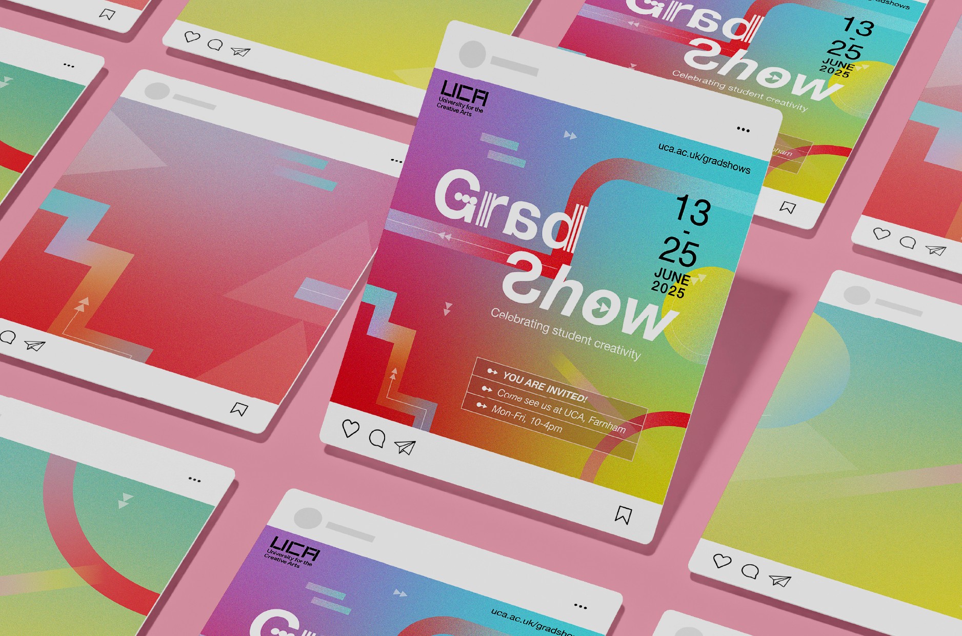
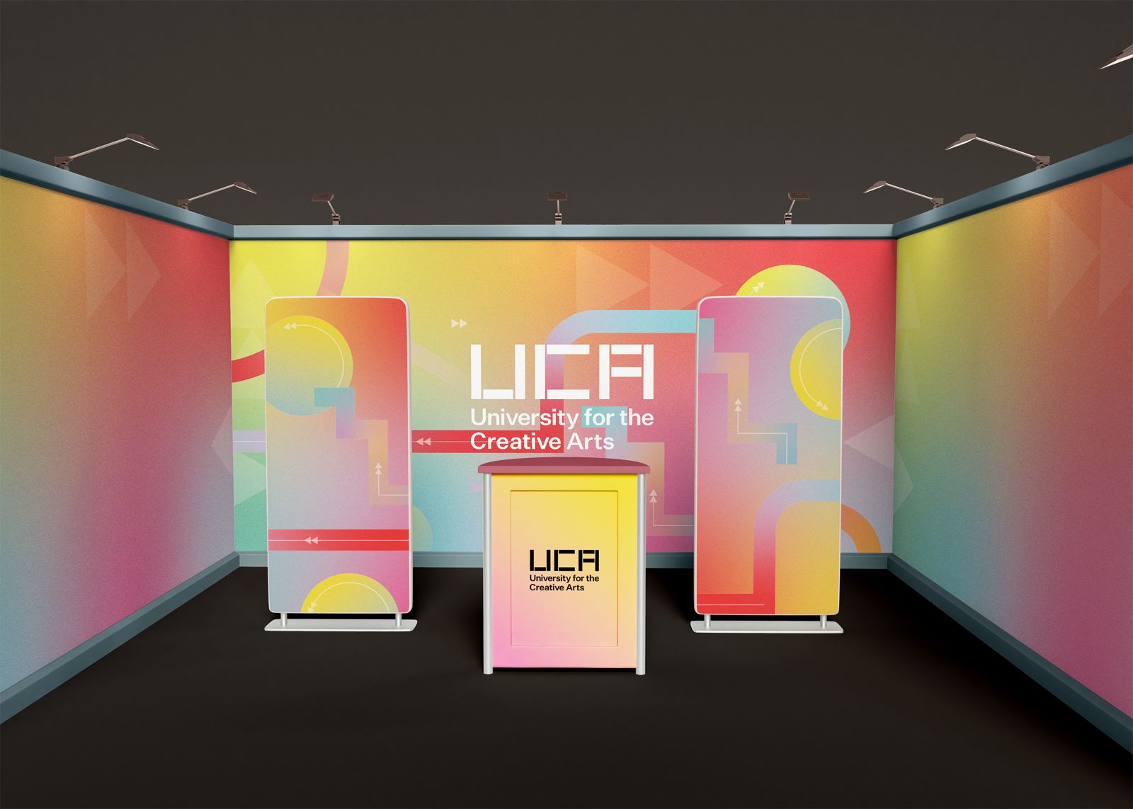
Ah, let me walk you through this vibrant piece of work - the UCA Grad Show identity that turns a traditional end-of-year showcase into something that feels more like a creative festival!


You know that electric feeling you get when you're about to see something amazing?
That's exactly what I tried to capture with this gradient-rich, motion-inspired design system. We're talking sunset meets digital age - warm corals melting into purples and yellows, with these geometric steps that feel like they're leading you right into the next big thing in design. ✨
The Design Language


I'll let you in on a little secret - those step patterns aren't just for looks. They represent the students' journey from education to industry, but make it fashion, you know? Each element plays with this idea of transition and movement:
Gradients that shift like a creative mind at work
Angular shapes that suggest progress and direction
Typography that's clean enough to be professional but playful enough to say "hey, we're creatives here!"
The Secret Sauce
What makes this identity sing is how it manages to be both cohesive and flexible.
Those gradient color combos? They work just as beautifully on a huge banner as they do on an Instagram post. The messaging feels clean and professional while still having that spark of creative energy that says "these aren't your average graduates."
The Outcome
End result? A grad show that feels less like a formal exhibition and more like a celebration of creative potential. Every piece works together to create this atmosphere of "you're about to discover something cool." And isn't that exactly what a grad show should feel like?