This project was commissioned by BFM Radio, a prominent Malaysian radio station known for its insightful discussions on business, finance, and current affairs. The objective was to create a visually compelling and informative design that captures the essence of BFM's healthcare forum, while also being suitable for various applications, from social media promotion to event backdrops.
The star of the show is this crafted eye shape made up of healthcare icons with medical symbols! The concept visually represents "future-focused health & care system" in a way that's both sophisticated and surprisingly playful. Kind of like if a medical textbook went to art school and came back super cool. 😄

The most striking element is the stylized eye formed by interconnected healthcare icons. This was a deliberate choice, rich in symbolism. The eye represents vision, insight, and awareness – all crucial qualities embodied by BFM's journalistic approach. It suggests that BFM provides listeners with a unique perspective on healthcare issues, helping them see the bigger picture.
For me, what really makes this design sing is how it manages to be:
Professional without being boring
Healthcare-focused without being sterile
Complex without being complicated
Informative while still being visually engaging
I was going for event materials that actually make you want to attend a healthcare talk (now that's magic!)
Icon Game Strong
Let's talk about those icons because they're working overtime:
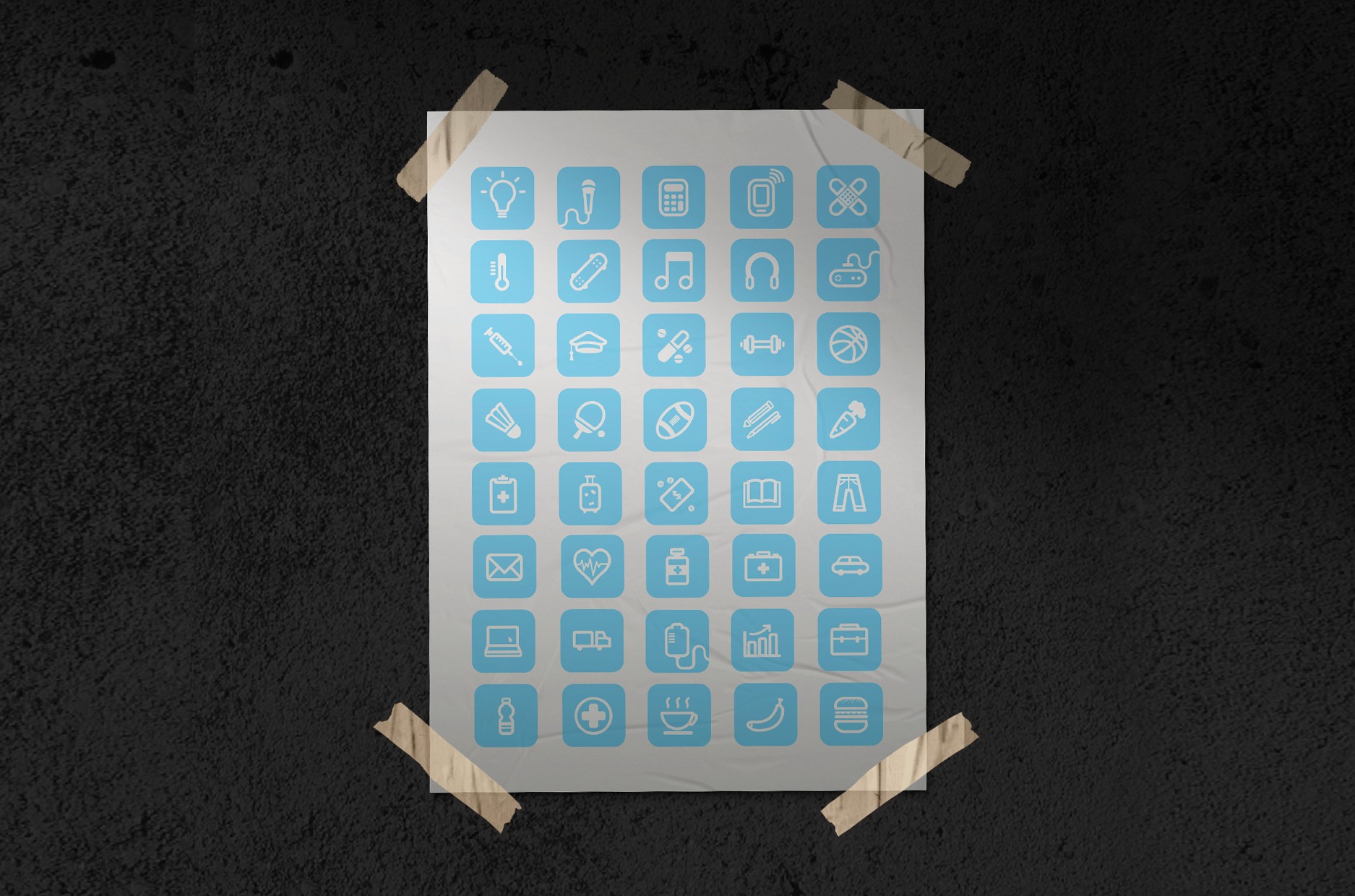
Within the eye, I've meticulously arranged a diverse range of healthcare icons – stethoscopes, hearts, pills, medical crosses, and more. This wasn't a random assortment. Each icon represents a specific facet of the healthcare ecosystem, from diagnosis and treatment to wellness and pharmaceuticals.
They were crafted with consistent line weights and rounded corners – that's the kind of detail that makes designers do a happy dance! It's a whole collection of custom-designed icons that are both simple and instantly recognizable.
The icons, rendered in a clean, minimalist style, ensure clarity and easy comprehension, even at smaller scales.
Usage & Applications

The color scheme is a carefully balanced blend of vibrancy and trustworthiness. The dominant blues evoke feelings of calm, stability, and health, while the pops of red and orange add a touch of energy and urgency, reflecting the dynamic nature of the healthcare industry.
Imagine the colors as the vital signs of the design, each contributing to the overall health and impact of the visual. The use of a gradient within the eye adds depth and dynamism, drawing the viewer's eye (pun intended!) to the center.
I designed this project in mind — wanting to make healthcare feel less intimidating and more human – exactly what you want when you're talking about the future of health and care systems.
The Vibrant Color Palette
This BFM Radio healthcare forum design is a proof of the power of visual communication. The hanging banner makes a statement without screaming.
I used fresh, optimistic light blue as the base color (very healthcare-friendly without being clinical)
Pops of warm pink that add energy and warmth (because nobody wants healthcare to feel cold, right?)
Orange accents that bring in that touch of BFM's brand identity
Clean white background that lets everything breathe (unlike actual hospital waiting rooms!)
The branding is subtly integrated, with the logo placed discreetly at the top. The event details – date and time – are clearly displayed, but without overpowering the central visual. This ensures that the focus remains on the powerful visual metaphor of the eye.
Think of it as the "all-seeing eye" of healthcare knowledge — with BFM at its center.
