You know how some beauty brands take themselves way too seriously? Not this one! For Bewtyroot, I created a brand identity that feels like your stylish best friend who also happens to be a haircare genius. Plus, Bewtyroot is all rooted in sustainability — because why not make great hair days eco-friendly too? That's why beetroot takes center stage, bringing natural goodness to haircare without compromising the planet.
The design language balances professional expertise with an approachable, almost playful vibe that makes you want to reach through the screen and grab those products.


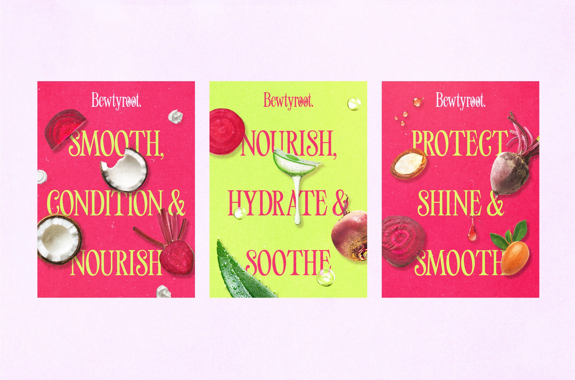
I went with a bold yet feminine color palette that pops right off the shelf - think vibrant fuchsia pink paired with punchy lime green accents. It's unexpected for a haircare brand, which is exactly what makes it memorable. The retro-inspired typography (how fun is that logo?) adds a dash of vintage charm while keeping things modern and fresh.
Photography & Art Direction
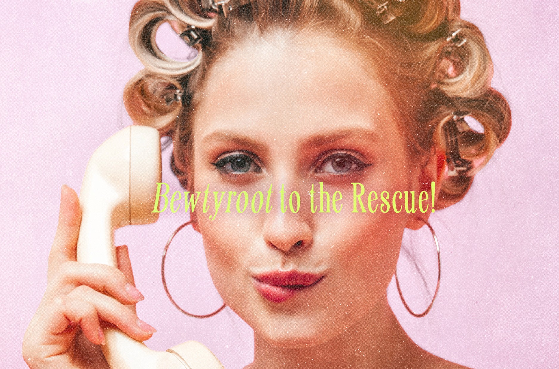

The photo direction is where things get really interesting. Instead of the typical "model with perfect hair" shots, I mixed in some quirky, editorial-style images that feel more like a fashion magazine than a haircare line. There's this fantastic shot with vintage curlers that perfectly captures the brand's personality - professional products that don't take themselves too seriously.
Packaging & Product Design

The product packaging is where functionality meets fun. Bold typography makes product benefits super clear (hello, "Nourish, Hydrate & Soothe"!), while the geometric patterns and playful elements keep it from feeling clinical. The way the products are photographed - sometimes straight-on, sometimes in these amazing lifestyle shots - shows off both the practical and personality sides of the brand.

Brand Story Elements
What I love about this project is how it weaves in subtle nostalgic elements (like that adorable vintage TV set) while staying thoroughly modern. The design showcases how I maintained consistency across all touchpoints while giving each piece room to shine on its own.
Technical Execution
Custom typography development
Strategic color palette selection
Product photography art direction
Packaging design system
Brand identity guidelines
Marketing collateral design